case study:
goodreads
TIME Role
4 days Heuristic Evaluation
Visual Competitor Analysis
Mid-fidelity
High-fidelity & Prototype
The goal of this exercise was to apply UX/UI design principles to redesign the Goodreads app, addressing its outdated design and improving its functionality and efficiency. The objective was to create a more user-friendly and visually appealing experience for Goodreads users.
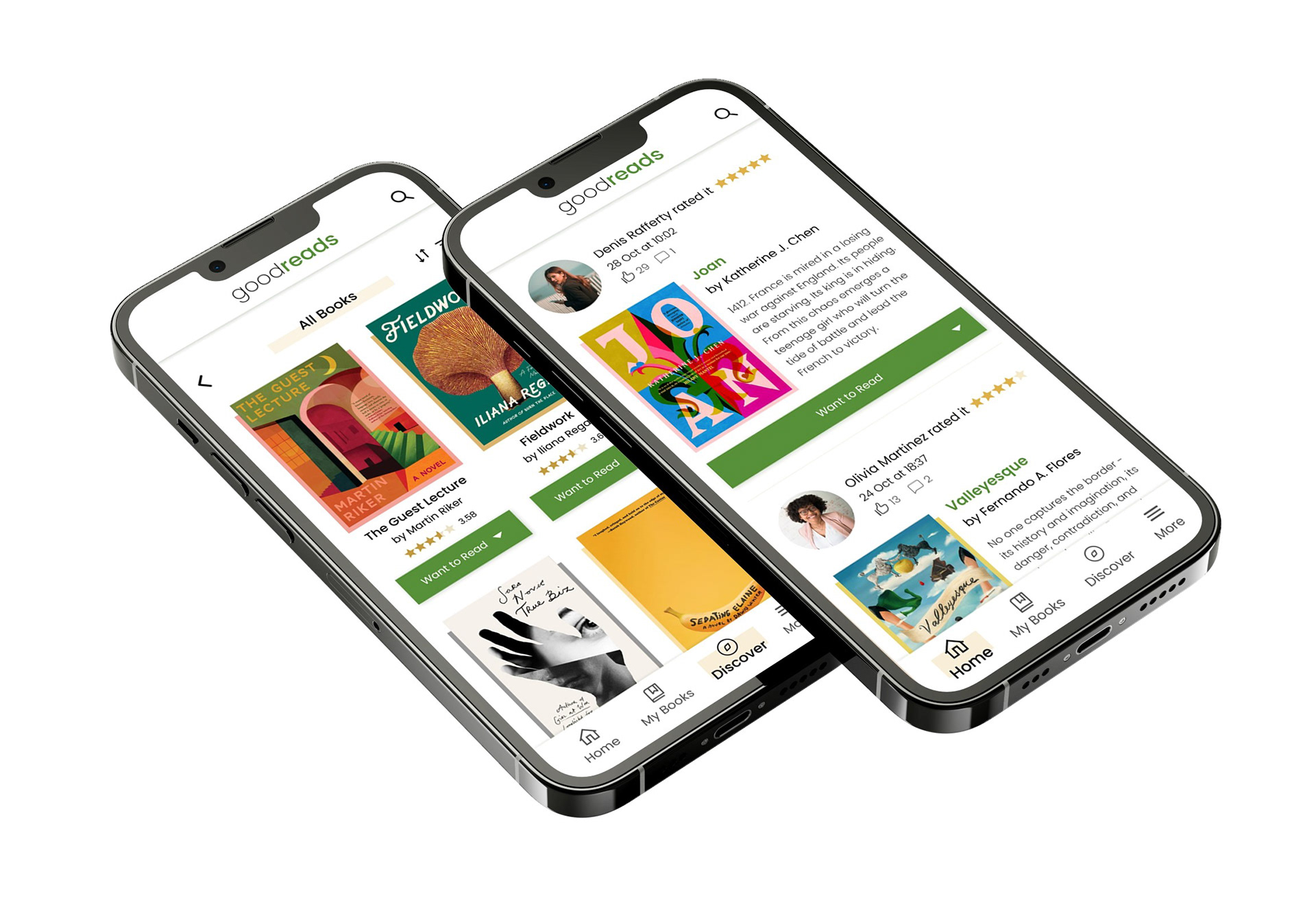
Screens of redesigned Goodreads
Problem
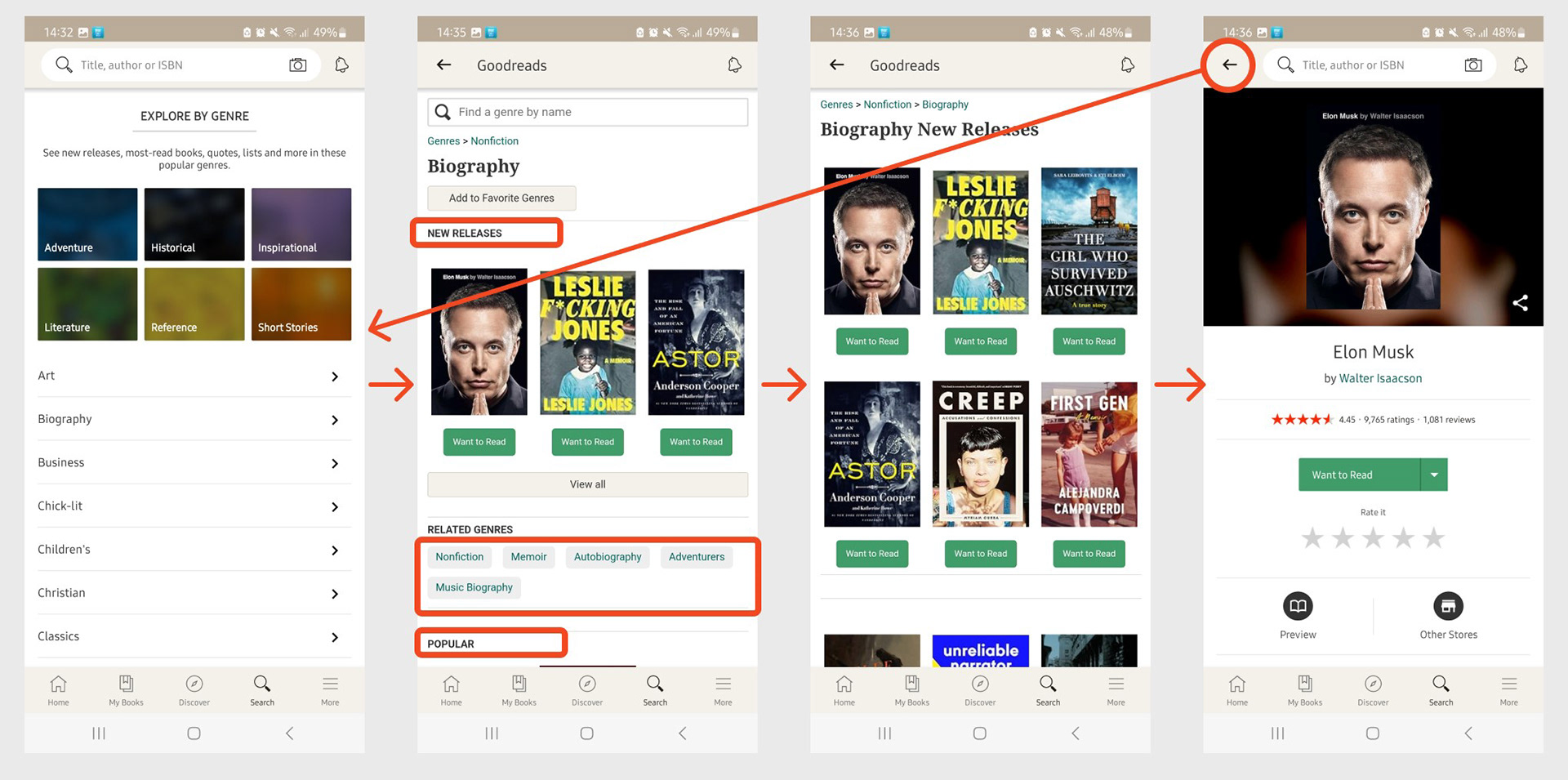
During the Heuristics Evaluation, I identified inconsistencies and issues with functionality and efficiency in the app. For example, clicking the 'Search' button leads to different genres, then to subcategories, and finally to a list of books, with no filter option available. Additionally, navigating back to chosen subcategories from a book page redirects users to the initial screen, undermining user control and freedom.
Current screens of Goodreads
VISUAL COMPETITIVE ANALYSIS
I looked at competitors and created Visual Competitive Analysis. I have found a couple of similar apps although none of them had exactly the same functionality as Goodreads. Nonetheless, the apps have minimalistic design and their color palette consists of blues and purples.
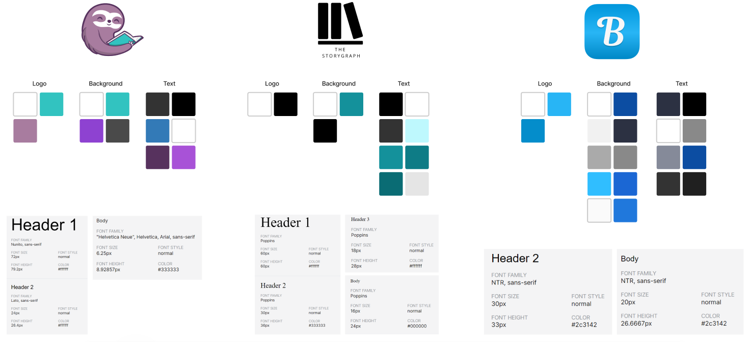
BookSloth, The StoryGraph & Bookly
MOODBOARD
Having listed the problems Goodreads has and creating my mid-fidelities, I have began building the moodboard that would help me decide on the design for the redesign. I have found some other examples of the minimalistic apps and very creative book covers that helped me on the color selection.
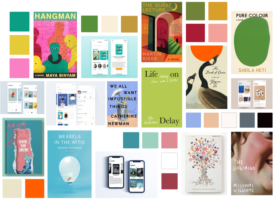
Moodboard for re-design
BRAND ATTRIBUTES
My goal was to bring fresh air with a design that is modern and warm. My palette is a mix of greens, gold, beige, pink, and blues, creating an inviting atmosphere. The primary colors that we can see through the logo and design elements are white, black, and green. Playful accents of pink and shades of blue add a personality, while goldish-yellow and beige hues add warmth and friendliness.
I chose Poppins font to keep things contemporary and easy on the eyes. The vibe is all about crisp rectangular shapes, sharp and clean.
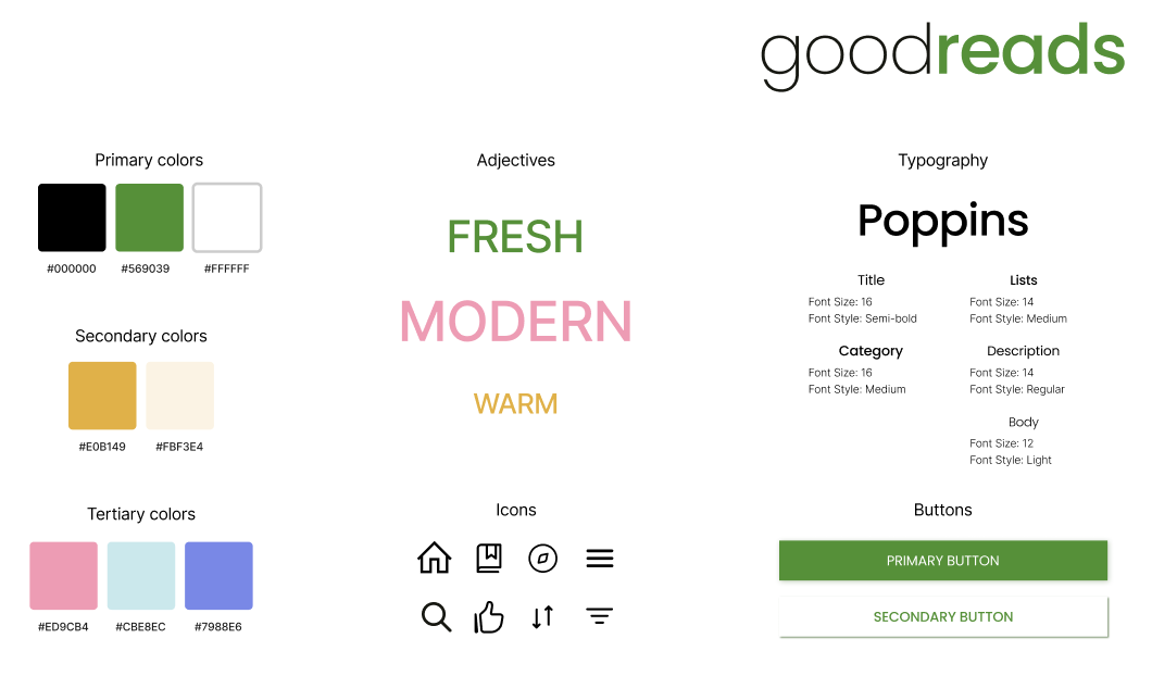
Brand Attributes for Goodreads
HIGH-FIDELITY & PROTOTYPE
As a result, my redesign brings freshness and more contemporary look. The app is welcoming and better organized. I have connected two buttons (“Search” and “Discover”) into one since they have the same functionality. Right now, on “Discover” page we can choose genre or recommended list (like “All Books”, “Popular”, etc) and from there we go to a list of books with Filter option available.
The high-fidelity redesign aims not only for aesthetic appeal but also for enhanced functionality and user-friendly interaction.
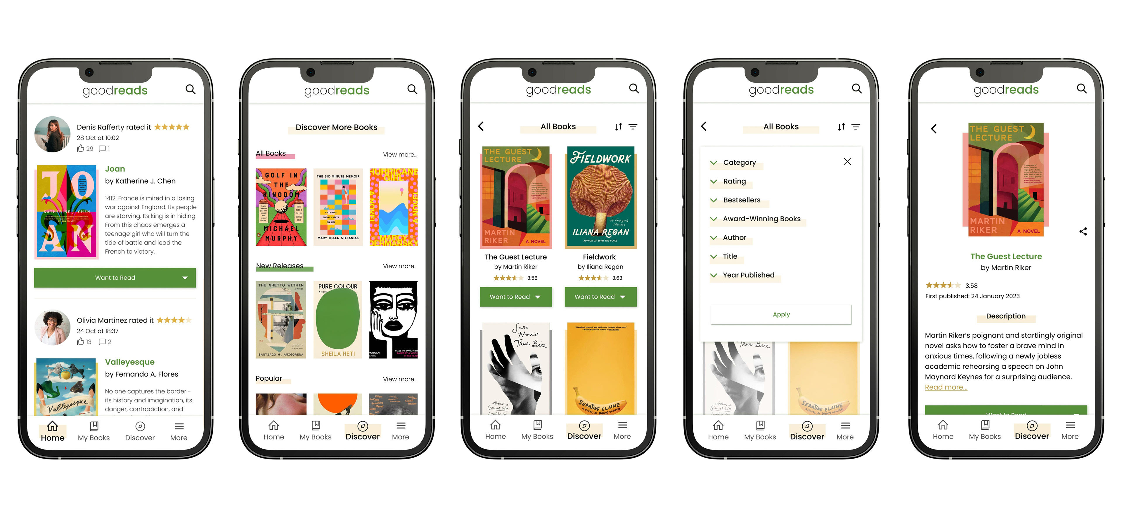
Redesigned high-fidelity frames of Goodreads